Prototyping
Website hompage UX Design
What I did
- Built Main Menu based on User Analytics
- Created instantly recognisable CTA
- Suggesting photographic theme for target market
- Minimising text using tabs as animated reveals
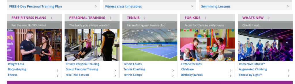
The Original Design
After taking a look at the analytics, the most used pages were added to the always visible top menu.
- Timetables
- Memberships
- Brochure
- Contact
Since West Wood have a number of gyms around Dublin some results showed high traffic volumes going to specific gym pages which would normally make that gym a good candidate for the main menu. However the workflow showed that nearly all of the users were searching for that gym’s ‘timetables’.
This makes Timetables No.1 priority for users who are already members.
Mobile Menu
In Mobile View the 4 top Menu items appear as Buttons and the Purple Menu appear as a hamburger Menu. The 3 main items are repeated again under the Slide – so it’s easier to find with a quick scan on desktop.
![]()
Logo & Tagline
They appear on each page but are very small to keep the layout focused on the CTAs.
Purple
It gives some energy to the page and is keeping with the aspirational brand.
Call to action
One of the requirements was to make CTA stand out so that it is instantly identifiable on a page. This way the user is not distracted unnecessarily.
The ‘4’ in the icon I designed is a variation of the WW graphic in the West Wood logo (turned on its side)
This not only stands out on a page but also marries in well with the Brand Logo.
Also note that there are 3 different fonts used in the logo and tagline, these too have been incorporated in the CTA giving it the added function of reflecting the brand.
Main Image
The difficult task of appealing to all personas with various fitness levels and age groups can be easily achieved by using an image of friends having a good time. They are ordinary people either enjoying their exercise together or having fun together after exercising.
Marketing the gym as a fun place to come with friends, emphasing the message “more than just a gym” which is inline with their marketing objectives and echos the CTA which says “For you and a Friend” so this type of image would also tie in well with the main CTA.
Featured Services Boxes
In keeping with current design I used images here – but they are subdued with an overlay – this make the page easy to read and less busy – Text only reveals on mouse hover (see Fitness Classes)
Unique Selling Points
USP (Free Fitnesss Plans etc)
Still keeping the items in current design, but switching the orientation can break up the page so that it does not look like a big list of services – using Icons only is an option here too – but a cut out on fill colour background can be nice for navigation. Each line can be a link or entire slide (or read more button) could be a link to page content.